Responsive website redesign
Balancing MVP vs. Phase 2 releases
2019 Team Lead
Case Study
Firstborn and Isobar were hired to help launch a new, responsive website that would align with the client’s new brand.
We were initially tasked with defining the minimum viable product—the least that the client would need to announce its brand—for launch three months later. We would then go on in the second phase, to evolve the MVP design for the full transformation of their old digital presence.
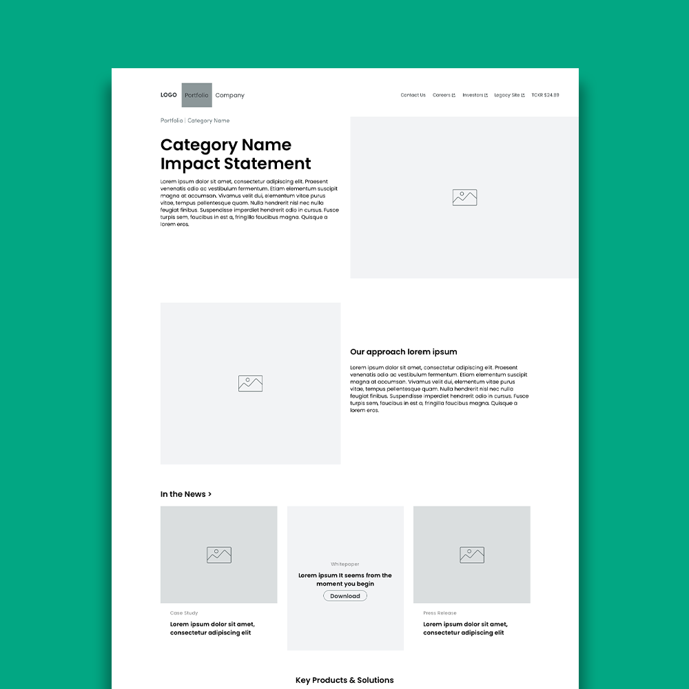
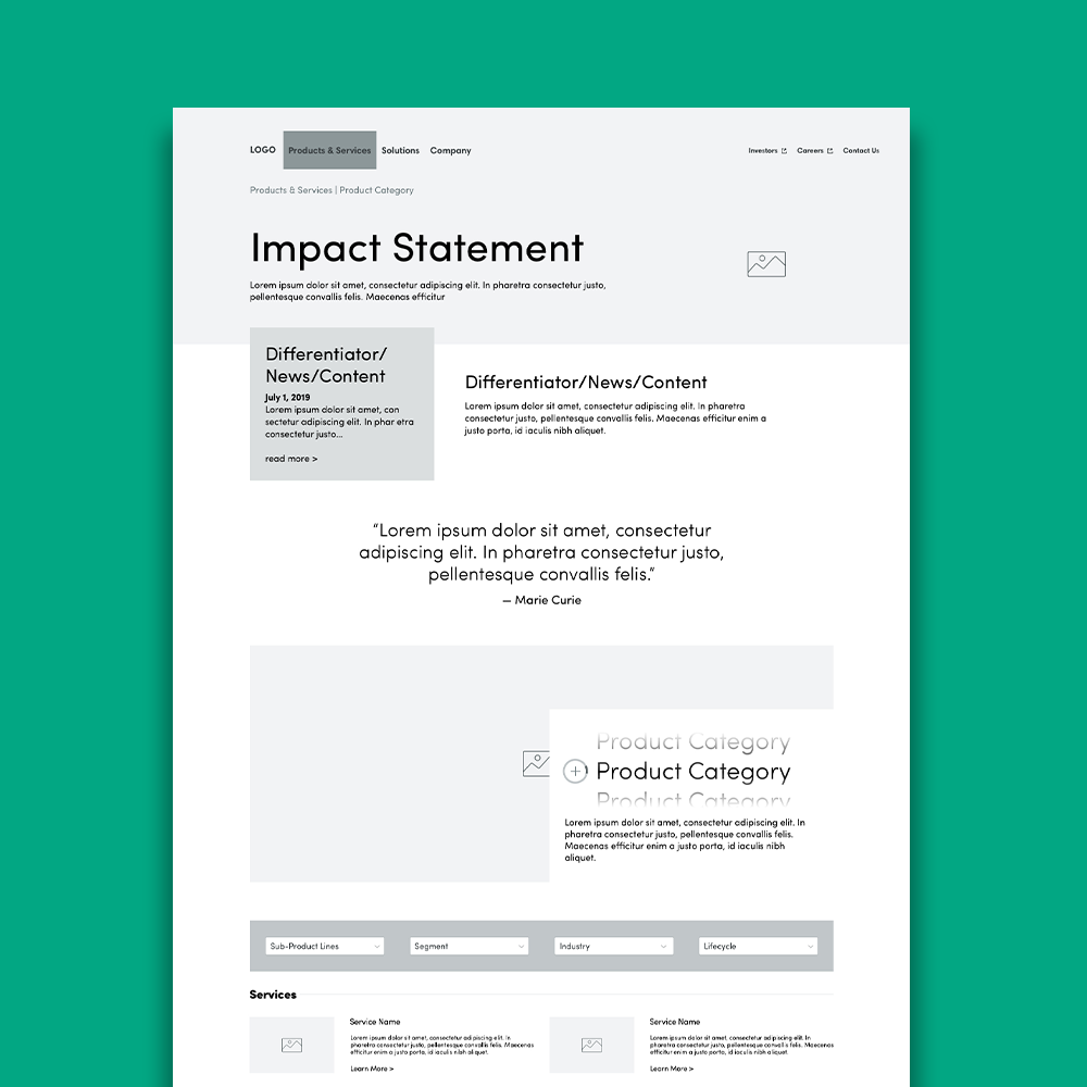
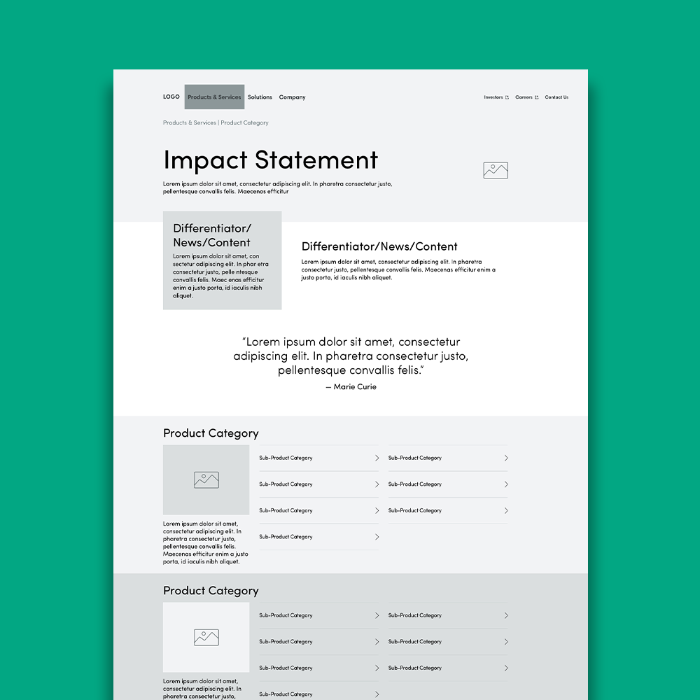
Initially, during Phase 1, we were trying to balance having a minimal, menu-less primary navigation bar with allowing the user to browse the full depth of products and services. The challenge, though, was representing a product tree up to eight levels deep. To solve these issues, I developed two options for secondary and tertiary navigation of products and services on a single page.
After the client reacted positively to the navigation in the first option and the product layout of the second option we started to flesh out a combined solution. However, once we stepped back and discussed the options with our engineering team we realized that the client’s time constraints for launch of the MVP would not leave time to put such a complicated design into place.. Additionally, while the client’s product team liked the solution, the business units were still trying to determine how the products and services would be grouped on the new website.
For our next iteration we made the decision that the MVP site would only feature their two most important product solutions, which would each get detailed pages of their own. This would keep the navigation simple for the initial launch.
When we then turned to designing the product pages for the full site transformation we were able to develop a richer navigation system both in the navigation bar and on the page.
Learnings
Despite the close collaboration between our team and the client’s team, there could have been more honest communication about our respective visions for the site early on when defining the MVP. Our ambitious designs didn’t align with how they were redefining themselves and led to an outsized amount of time being allocated to iterating on the navigation and product pages.
Figures


